BrandingLogoIdentity
Hommission/Real estate
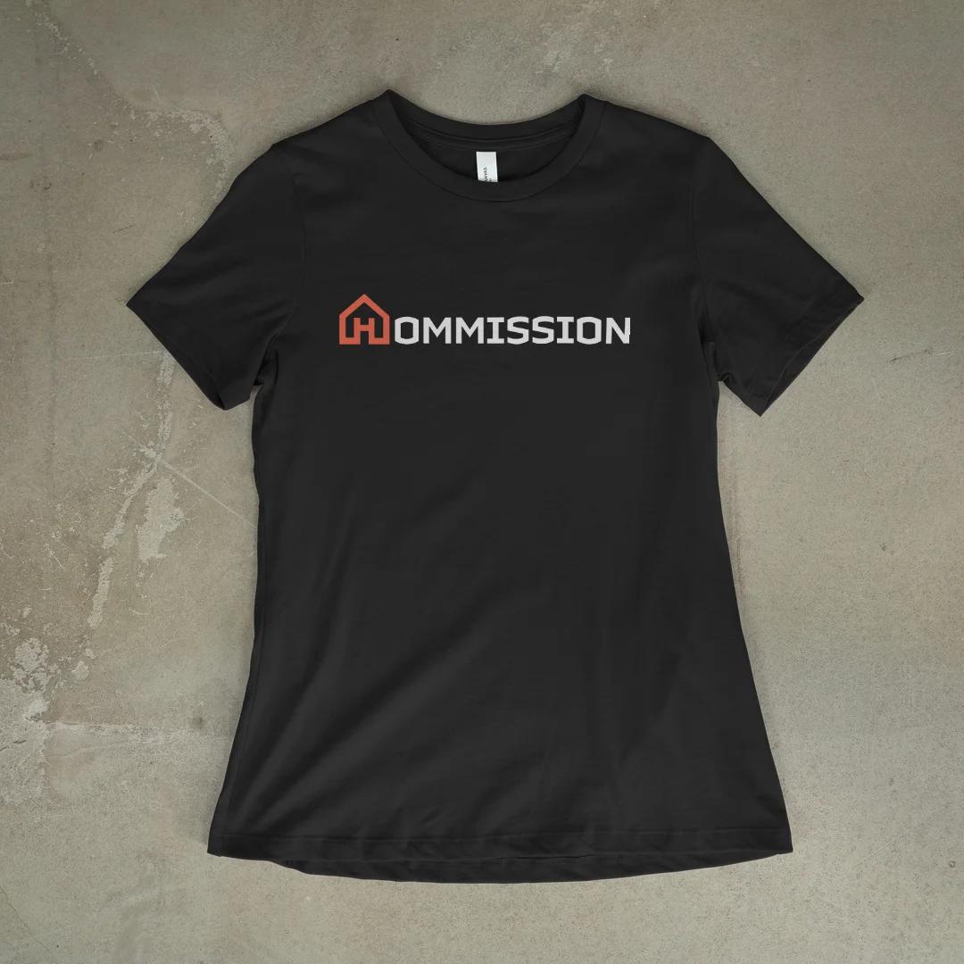
A real-estate brand that looks warm instead of corporate blue. The H is drawn as a house, so the letter and the category are one shape. Coral keeps it friendly, and a heavy black wordmark anchors it.
Services
Logo design, brand identity
Timeline
Delivered
Tools
Illustrator


In use
Next project
Trackr